What do you think of the new Seventeen Lightstick?
Wie gefällt dir der neue Seventeen Lightstick?
Autor: Helen Bosch / Feb 21, 2023

K-Pop Blog > News > Seventeen
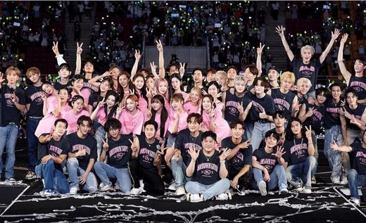
Heute erschien die neue Version von Seventeens Lightstick, der wie seine Vorgänger “Caratbong” genannt wird, angelehnt an den Fandom Namen “Carat”. Der erste Lightstick kam in 2017 raus und Version 2 in 2019.

Version 2 erfreut sich bis heute großer Beliebtheit und wird von vielen Fans als einer der schönsten K-Pop Lightsticks überhaupt bezeichnet. Auch von denjenigen, die die Boygroup Seventeen nicht gut kennen. Nicht ohne Grund, denn Version zwei besteht aus einem Stab, der in Rosa, Blau und Grün schillert. Das Kopfstück ist eine glitzernde, transparente Kuppel. Darin befindet sich ein blauer Diamant auf einem rosa Sockel.
Seventeen Fans lieben ihn nicht nur, weil er so magisch und edel aussieht, sondern auch, weil die offiziellen Fanfarben “Rosenquarz” (Rosa) und “Serenity” (Blau) stark vertreten sind.
Wie soll man das noch toppen?
Diese Frage stellten sich nicht wenige Fans, als eine neue Version des ikonischen Lightsticks angekündigt wurde. Der Konzept Teaser, der vor wenigen Tagen auf Youtube hochgeladen wurde, war augenblicklich das Gesprächsthema Nummer eins!
Version 3 ist dem Vorgänger in einigen Punkten sehr ähnlich.

Auf einem schillernden Stab sitzt eine transparente Kuppel, in deren Inneren ein Diamant auf einem Sockel thront. Die neue Kuppel ist allerdings glatt und rund und glitzert nicht. Aber sie wirkt dadurch vielleicht noch eleganter.
Am meisten diskutieren Fans über die Farben: Diamant und Sockel sind pink und der Stab schwarz. Nicht wenige sind enttäuscht, weil sie darauf gehofft haben, die vertrauten Fanfarben wiederzusehen. In den Kommentaren auf Twitter wird mehrfach die Frage gestellt, warum der Stab schwarz ist und der ein oder andere findet sogar, dass der Lightstick eher zu Blackpink passt, als zu Seventeen.
Obwohl Version 3 zweifellos sehr schick aussieht, ist sich die Mehrheit einig, dass sie nicht an Version 2 heranreicht.
Was hältst du von dem neuen Lightstick?
Quellen: Seventeen Twitter, Seventeen Youtube
Das könnte Dich auch interessieren


5% RABATT BEI NEWSLETTER ANMELDUNG
Die neuesten Produkte, Aktionen und News. Direkt in dein Postfach.